DAI Knowledge Hub: Lightweight Portal for Field Teams
- gawonlee
- Aug 22
- 2 min read
Updated: 1 day ago

Project Introduction
Timeline: 9 month sprint + 2 month redesign (2024 – 2025)
Project Type: Internal Web Dashboard
Tools Used: Adobe XD (2024), Figma (2024–2025), Illustrator, Photoshop
Team & Role
Designer: Gawon Lee
Project Lead: Mónica Peiró Vallejo (Director of Strategy and Innovation, EU Business Unit)
IT Lead: Elvis Lezcano (Director of Software Development, IT)
Scrum Lead: Darko Radojević (Principal Scrum Lead, DAI Technology)
Programmers: Rotating developer team


Overview
This internal dashboard was designed for DAI to help field staff in Nepal and across Africa access the knowledge, tools, and people they needed. Because most users connected with tablets or small laptops through tethering, we fixed the layout width at 824px, skipped responsive development, and kept navigation simple. The priority in 2024 was speed of release. We launched in the fall, and during the winter worked on the redesign for version two.

Design System
A targeted design system was built to serve the needs of a lightweight dashboard. It emphasized clarity, reusability, and performance under field conditions.
**Image left is low-res to protect internal content. It outlines the structure of a lightweight design system built specifically for this project.


**Data Sensitivity & Content Handling
All content shown here is placeholder-level and safe for public sharing. Even during prototyping, all numbers and labels were fictional. Descriptive text—excluding UI copy—was adapted from DAI’s publicly available materials.


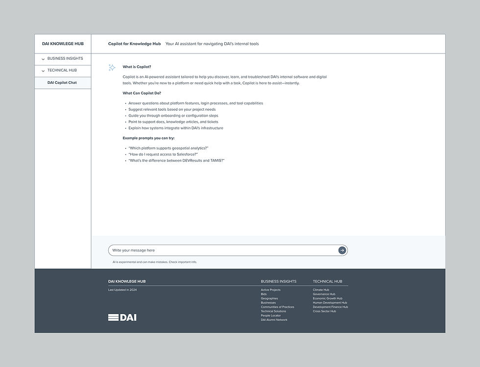
Working with Power BI
Some sections required live maps, charts, and tables that updated monthly. I met regularly with the data specialist to align them with the overall design and add interactions. It was his first time working with a designer, and my first time using BI tools and Mapbox—so we learned together along the way.
Simple and Repeatable Layout
Most pages followed an accordion-based structure, allowing users to focus on one section at a time. We carefully grouped and separated content to improve readability while keeping the overall layout consistent and clean.
Redesign Overview
In the winter of 2024, we began a redesign and redefined the concept. The fixed-width layout for low-bandwidth tablets was replaced with a full-width experience for desktops and laptops (1920px, with content constrained to 1440px), along with a mobile-responsive version. This phase aimed to support more varied screen types and reflect how field staff were increasingly relying on smartphones instead of tablets.


Adapting to a Changing Field
By 2024, smartphones had overtaken tablets in the field. Better connectivity and longer battery life made them the more practical choice, even in remote regions. This shift pushed us to rethink the original design and expand it for both larger screens and mobile.


Takeaway
Designing for field-based teams means designing for change. Tools and habits shift faster than expected. Even though the project was eventually shelved, it taught me to listen closely, design flexibly, and stay ahead of emerging patterns—because what’s true today might not be tomorrow.


Comments